The Standard Reports Menu includes a graph/chart which can be collated to show financial details from your Weekly Sales Report.
From the 'Admin Financials and Reporting' application select the 'Standard Reports' option.
Select the Icon as shown below.
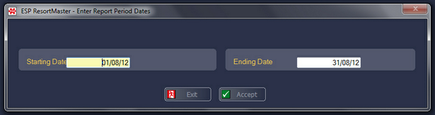
You will then be asked for the date range you wish to analyse and select F3 Accept.
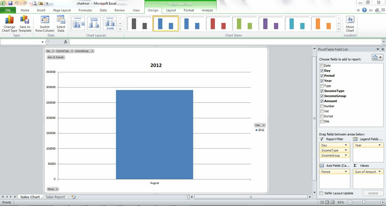
After a few seconds the chart will be displayed in Excel, similar to the example shown below..
Once the chart has been created in Excel, you are then able to use the Standard Excel Functionality to change the style of the chart, e.g. to a Pie Chart, Line Graph etc.
In addition there are specific filters on the graph which you can use to change the amount of data which is displayed, e.g. to view certain operators, sales areas, transaction types, etc.
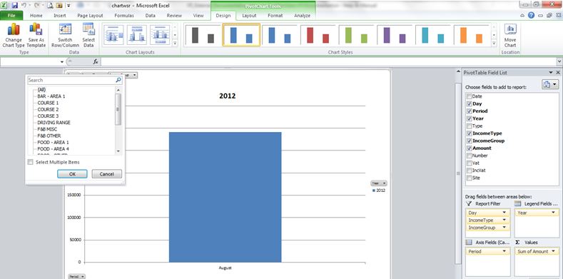
These filters are operated by selecting the drop-down arrows on the graph, as shown below.
|